Digg.com
In my analysis of wireframes, I thought it would be interesting to compare two websites that have essentially the same purpose, but different layouts. I mentioned in another post that Reddit.com is one of my favorite websites. Before I was turned on to Reddit, Digg.com is where I was at. Both websites house user provided content, with the most popular content making it to the home page. The visual challenge for both websites is to very clearly display the most popular trending posts in an intuitive manner.
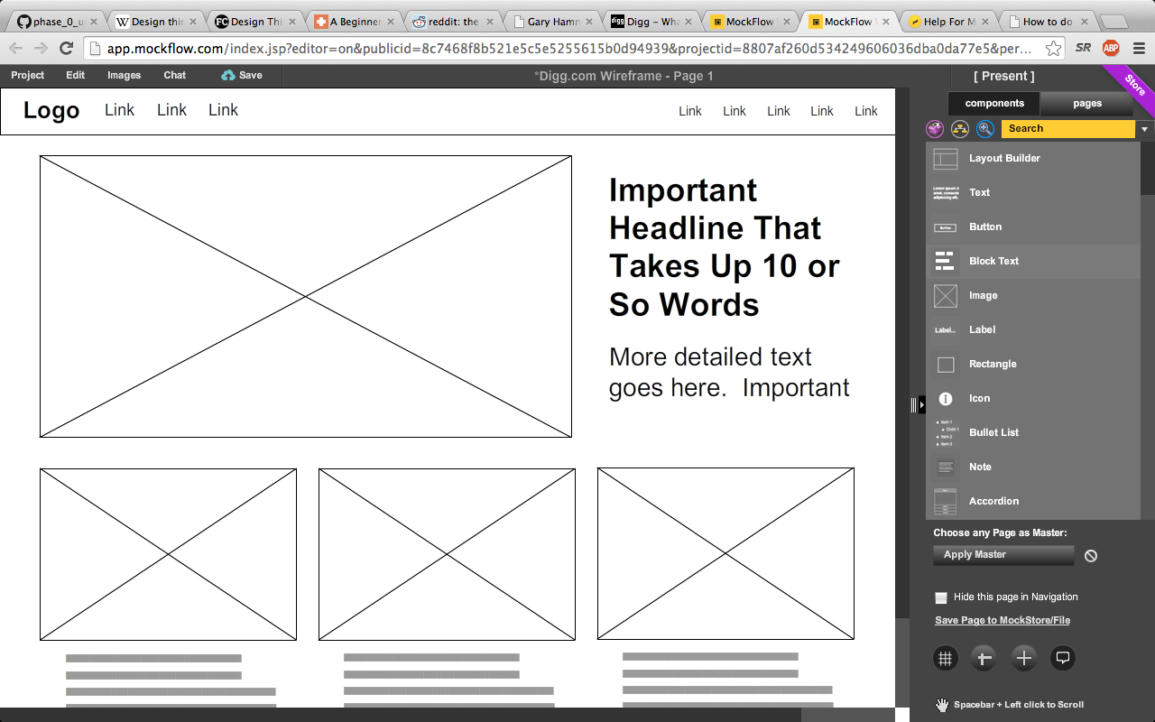
I took a shot at replicating Digg's wireframes using Mockflow online. It actually turned out to be pretty simple. Check out the screen shot:

As you can see, Digg keeps it pretty simple: The top headline is front and center and is sized larger then the next few headlines. In addition, Digg has their navigation panel placed right at the top of the page. Also, note the lack of advertisements visible when landing on the homepage.
Reddit.com
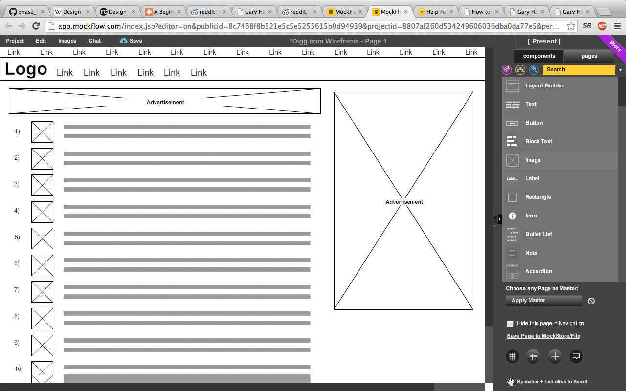
Now, let's check out Reddit.com, another website dedicated to user submitted content. Here's my attempt at copying their wire frames in Mockflow:

This layout is considerably more cluttered, and does not very visibly project the content in the top posts like Digg does. In addition, notice the amount of space taken up by advertisements in Reddit's layout. One benefit is that there is definitely more content on the screen than Digg, and its a pretty straight forward list, so it would be hard for the user to get lost.
So, what does this all boil down to? It's hard to say. Digg benefits from less clutter, larger images sizes, better emphasis of the top trending articls, and no advertisements. Reddit has significantly more content on the page available without scrolling, clearly ordered from 1-25. But, a decent chunk of space is used for advertisements.
In my personal opinion, I'm pretty much indifferent. I use Reddit more than digg, but that is mostly related to the content, as opposed to the layout. From a UX standpoing, I might lean just a little bit towards Digg.com due to its cleaner, less cluttered nature. I guess this just goes to show that different UX styles can be employed to accomplish the same goal. Which style would you prefer?
Copyright: Gary Hammell 2014